Hair Studio G10
A working salon business site, kept in the portfolio honestly as off-niche proof of real, live client work while the wellness list grows.
 jammy phan · jam drop
battle on therapy · solo mental-health practice, seattle and bellevue, wa · 2025–2026
Chris Batalon runs a solo practice for people who hesitate before they book: Asian and Asian American adults, men of colour, minority professionals, working through anxiety, trauma, burnout, identity and life transitions. His old site was an off-the-shelf WordPress theme that read like every other one in the category. Studio Lucky Bamboo rebuilt it in Webflow around a single idea, "Therapy In A Site", where the page itself carries the emotional arc instead of the copy explaining it. Contract signed 31 May 2025, soft launch August 2025, handoff January 2026. It is live at battleontherapy.com, and everything described below can be checked there.
there are no conversion tiles · the outcome section says why, once, and it is not repeated
Battle On Therapy was running on an off-the-shelf WPZOOM WordPress theme. Reviewing competitors together, Chris was blunt about what he was seeing across his own field: sites that looked dated, text-heavy, long and interchangeable, and basic in a way that was not the feeling he wanted for his practice. What he asked for instead was a strong opening screen, less text carrying more feeling, specialties listed plainly, and insurance answered early rather than buried.
The harder problem was the audience. Chris's practice exists for people who need reassurance before they will reach out. Adults roughly 25 to 45, navigating anxiety, trauma, burnout, identity and life transitions, many of them men of colour who have never sat across from a therapist who looks like them. A cold, clinical page does not just under-convert for that reader. It confirms the fear that brought them there.
And the niche had to read correctly without narrowing. Chris was explicit that the site needed to speak to men of colour and to women of colour, broader than the Asian-American-only framing on a reference site he otherwise admired, without losing the specificity that makes a practice findable.
| old platform | WPZOOM WordPress theme. The domain battleontherapy.com was already good and was kept as-is; a "Battle On Therapy LLC" variant was considered and dropped as unnecessary. |
| practice | Solo licensed therapist, Battle On Therapy PLLC. Seattle and Bellevue in person, telehealth across Washington. |
| non-negotiable tone | Calm, safe, hopeful, human. Never clinical, never cold. |
| founding belief | He treats people, not disorders, which rules out disorder-first, checklist copy anywhere on the site. |
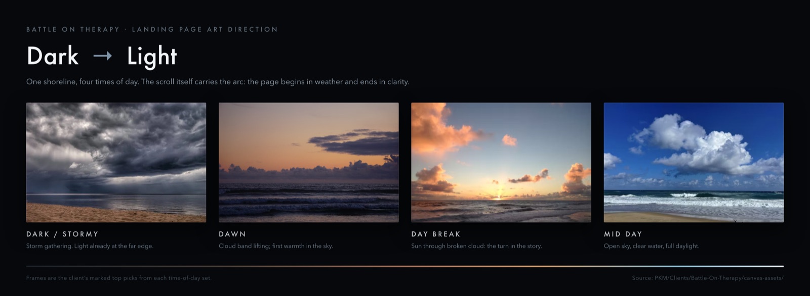
The concept we built to is "Therapy In A Site": a visitor should experience something like the shape of therapy just by scrolling, rather than being handed all the information at once. The emotional arc, from darkness through hope and clarity to reflection, is carried by the background itself, which shifts through time of day as you descend the page. Each section is lit for the thing it is asking of you.
The practice's own graphic mark was reused throughout as section dividers, CTA accents and custom icons in place of a generic icon set. The weight was argued explicitly and settled at roughly 90 per cent light progression to 10 per cent mark. A heavier 50/50 treatment was on the table and was rejected, because the mark was there to support the progression, not compete with it.
The contact form was cut to four fields: name, email, phone, and what brings you here. The zip code field was removed outright on privacy grounds, because a hesitant first-time visitor should not be asked to disclose where they live before they have decided anything. The site's content strategy was written to two stated directives: tone suggestive rather than directive, and less text, expanded on click or hover. Site voice was moved from "We Hear You" to "I'm Here With You." Credentials were made verifiable rather than decorative, issued as Accredible badges for the NASM Certified Personal Trainer and NASM Certified Nutrition Coach certifications, with the University of Washington badges deliberately held back rather than shipped half-confirmed.
Booking was wired to Calendly during the build, chosen over TidyCal and SimplePractice, both of which were on the shortlist. The live site's booking link now points to Alma (secure.helloalma.com/providers/chris-batalon/), the platform Chris's practice already runs its records and billing through.
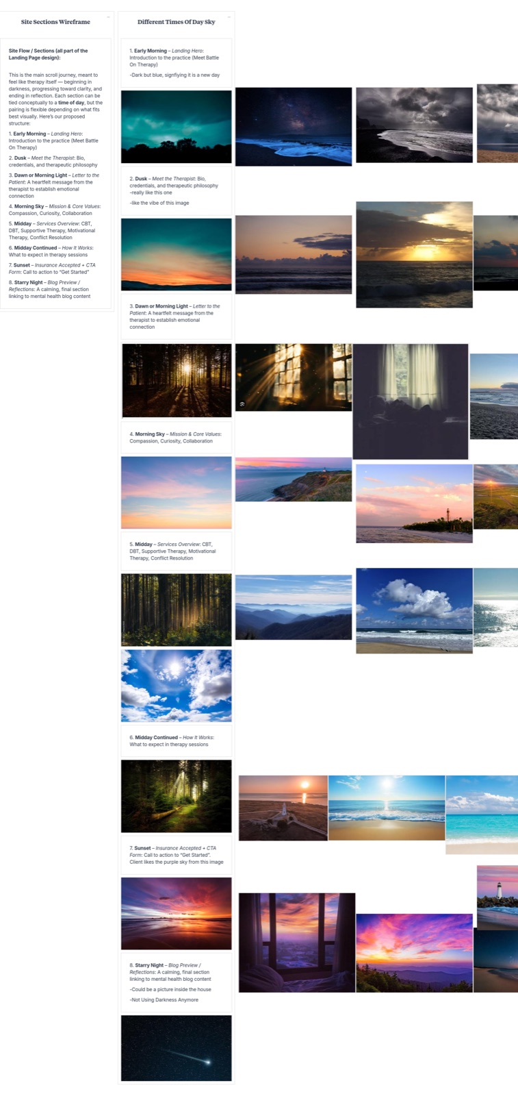
Eight Midjourney prompts were written, one per landing-page section, each with its own time of day and its own flags (--ar 16:9 --v 6 --quality 2). They ran to a large volume of generated concepts. None of that output shipped. Its job was to settle what each section should feel like, and the site was then built on real sourced photography, curated down to the client's own marked top picks across four separate sky and beach reference boards. The generated work is visible in the record; it was a direction-finding tool, and saying so is more useful than implying the site was generated.
transmission · method moment · the decision that made it buildableWe wanted the page to run dark → light → dark. We narrowed it to one direction.
The first version of the concept ran the arc in both directions, night into daylight and back into night, mirroring a full session. It reads beautifully as an idea. It is a genuinely difficult thing to build and a harder thing to keep consistent while copy gets edited for the next two years, because every section's lighting depends on its position in a curve that moves whenever a section moves.
So it was talked down to one direction, and the reasons were concrete rather than aesthetic. The practice's mark is black and white and sits naturally in the corner of a night sky, so that frame was already the strongest one. Chris asked that the opening not read too dark, which a lit starry night solves and pure black does not. And a single monotonic ramp survives editing, because adding a section only stretches the curve instead of breaking its symmetry.
The rule this became, and the studio has used since: ship the direction that survives its own maintenance. A signature effect that only holds on launch day is a liability, not a feature.
What the page actually does today is described in the outcome section, and it is not the same as this decision. Both are on the record here.
Chris brought the idea that made it cohere. He grew up on Oahu and still calls Hawaii home, and he proposed running the whole progression as one fixed camera angle on Ko'olina Beach, the same scene at every time of day, so the thing changing across the page is the light and not the place. The reason he gave for it was cohesion: one scene would tie the sections together. It stayed a secondary direction rather than the primary one, and it is not what shipped. It is still the clearest statement of what the site is about. The room doesn't change, you do.
| strategy and brand | Positioning, creative direction, the "Therapy In A Site" concept. |
| ux and ui | Full site design in Figma, section by section, ten dated landing-page iterations. |
| copy and ia | Written as Chris speaking directly to a client, not as clinical description. Includes the "Dear Fellow Traveler" letter, styled after a format Chris admired and framed on Irvin Yalom's "fellow travelers" idea from The Gift of Therapy. |
| build | Webflow plus Webflow CMS, mobile-responsive. |
| conversion and seo | Four-field intake, insurance answered on the page, location and modality architecture. |
| tools named | Figma, Webflow, Midjourney, Milanote, Adobe Creative Cloud, Accredible. |
Analytics were not installed on battleontherapy.com until 4 August 2026, roughly a year after the soft launch and seven months after handoff, so no before-and-after number exists for this project and none will be estimated; the studio now installs analytics at kickoff rather than at launch.
| contract signed | 31 May 2025 |
| onboarding | June 2025, week 2 |
| competitor research and concepting | June 2025, weeks 3–4 |
| mood board and icon work | July 2025, weeks 1–2 |
| page design | July–August 2025 |
| soft launch | August 2025, week 4 |
| design review, about / services / blog builds | September–November 2025 |
| production paused, illness | Early December 2025 |
| development and testing | December 2025, weeks 3–4 |
| ship, next steps, handoff meeting | January 2026 |
| analytics installed (ga4 + search console) | 4 August 2026 |
| change in consult requests | No baseline exists. |
| monthly completed bookings | No baseline exists. |
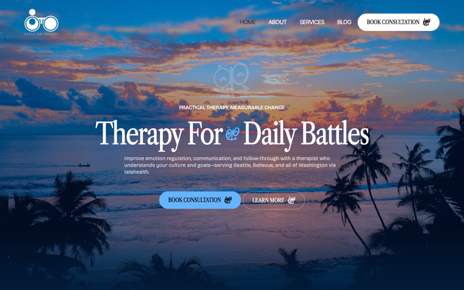
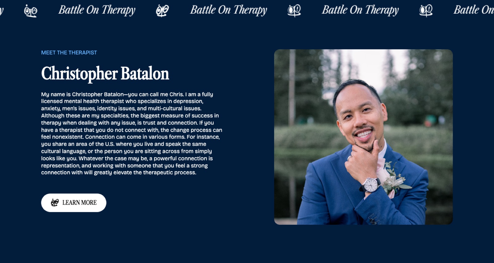
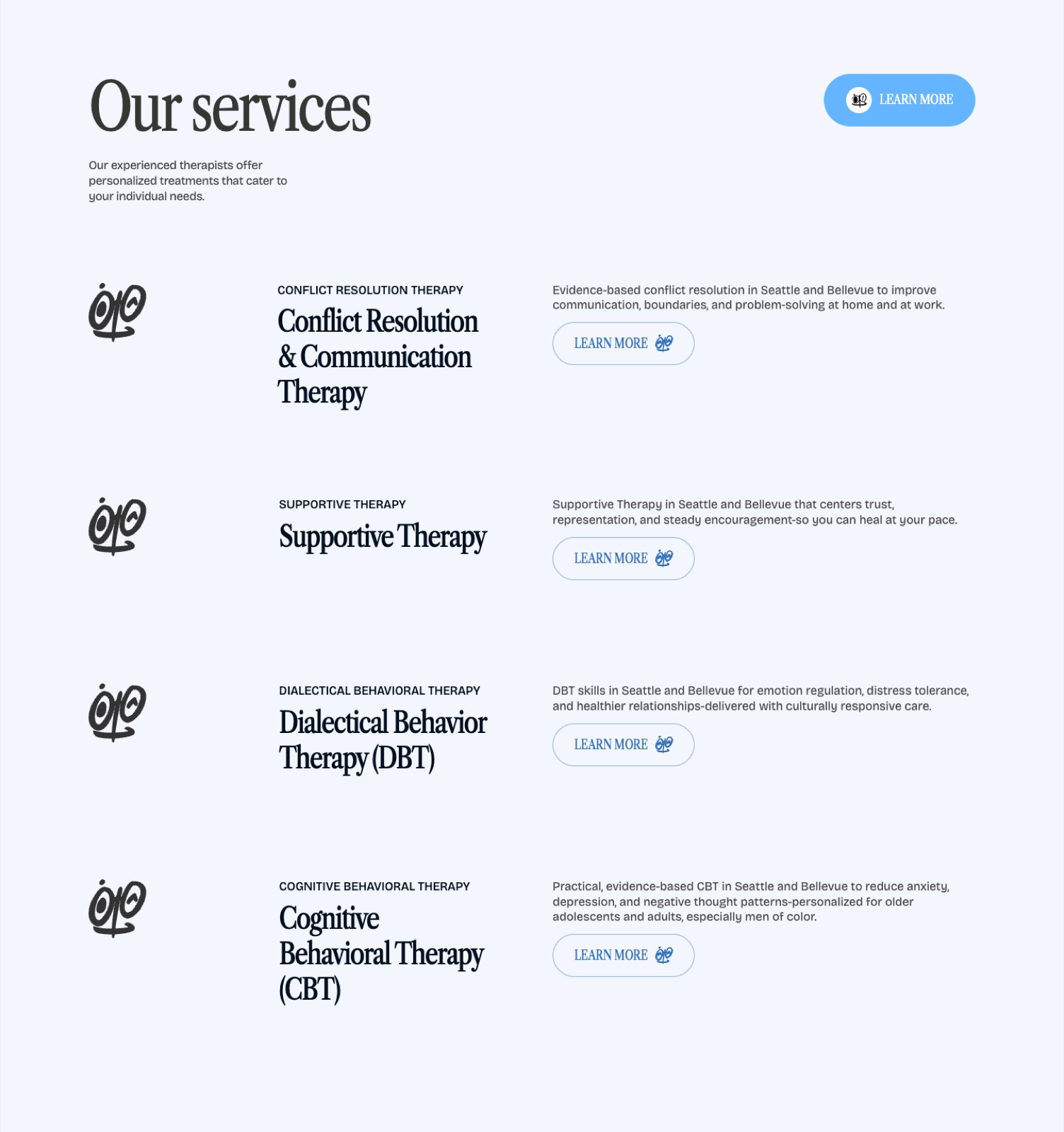
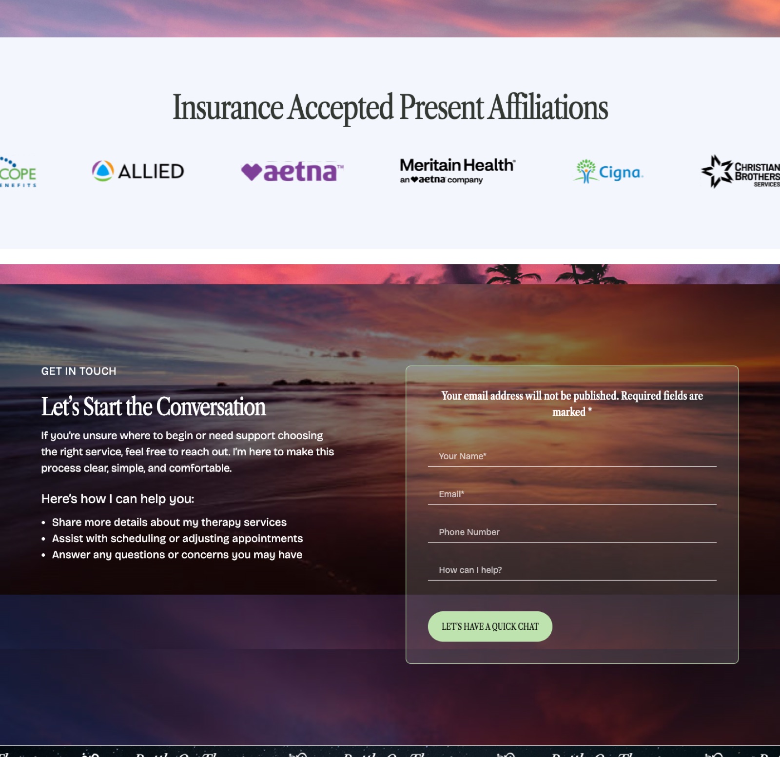
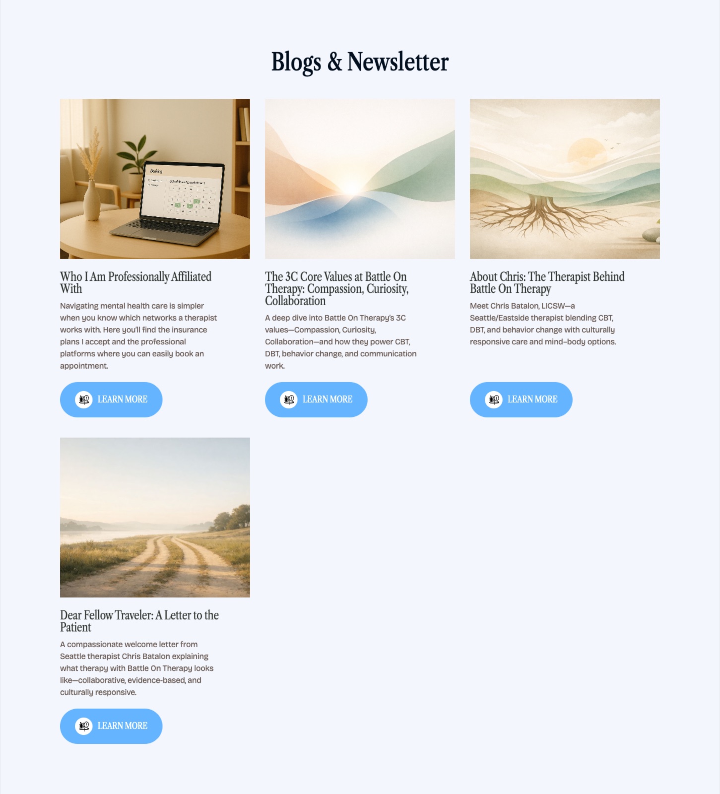
What is on the page today, read top to bottom on 2026-08-10: the hero, "Meet the therapist," the long-form "Dear fellow traveler" letter, "Why Choose Battle On Therapy" built on the three C's of compassion, curiosity and collaboration, the services section, a seven-step Battle On Therapy Step Plan running from initial connection and consultation through to transition and maintenance, the insurance marquee with its nine carriers, a blog and newsletter index, the contact form, and the footer. The homepage services section presents four modalities: Conflict Resolution and Communication Therapy, Supportive Therapy, DBT and CBT. Each is written in Chris's own voice rather than as clinical boilerplate.
Chris runs the site himself. He holds a Webflow content-editor seat with publishing turned on, verified active on 2026-08-04. The site runs on Webflow's CMS plan at $276 per year plus tax, billed directly to his own payment method through Webflow's client billing, so the hosting is his and not the studio's. That is worth stating plainly, because a client who cannot see or control what their site costs is a client who is stuck with their agency.
The design record is unambiguous about the decision: one direction, night to dusk, opening on a lit starry night rather than pure black. That is what the correspondence, the field note above, and the studio's own rule all describe.
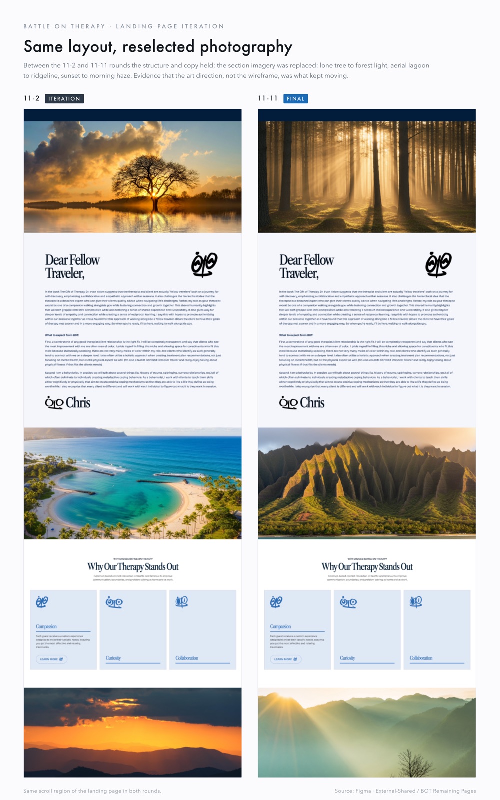
The live page runs its light differently. Reading top to bottom, the full-bleed photography goes dusk beach, golden light through a forest, misty mountains with a sunburst, a golden mountain range, a dark navy panel behind the step plan, a pink and lavender sunset, a purple dusk beach behind the contact form, and a night sky in the footer. It ends at night rather than beginning there, and it passes through daylight in the middle.
The record shows the arc was still moving while the work was underway. The eight Midjourney prompts, written early, run from a midnight hero to a starry-night reflections section at the end. The concept board's own eight-section wireframe opens at early morning and closes on starry night. The text-thread decision narrowed it to one direction. What shipped is closest to the wireframes and furthest from the correspondence, and the reason that happened is not recorded anywhere on file.
Either way the concept survives the difference. The site's light does change section by section, deliberately, in service of what each section asks of the reader. That is the thing that was built and it is on the page.
The engagement ran longer than planned. Chris was ill in early December and development moved into the new year. It is here because a case study that only reports the clean parts is not worth reading, and because the thing that made the delay survivable was the decision described above. A single-direction progression could absorb a paused schedule without the design falling out of sync with itself.
No account from Chris is on file. This slot stays visibly empty until he gives one. Nothing here is invented, and nothing will be.
The ledger and the account are a pair. One does not stand in for the other. An empty quote card is acceptable here; an invented one is not, and neither is quietly dropping the slot because the numbers are also missing.
No laptop shells, no floating phones, no perspective angles. The research is clear that device mockups read as portfolio decoration and that this buyer discounts them. Everything below is either the live page as captured on 2026-08-10 (1440 wide, clean signed-out browser, nothing retouched) or a clearly labelled artifact from the design record.
A working salon business site, kept in the portfolio honestly as off-niche proof of real, live client work while the wellness list grows.
A short list on purpose. One flagship studied in depth beats a wall of thumbnails.
mission file 001 · battle on therapy · post-flight report filed 2026-08-11 · jam drop